While it might not be as powerful as the industry standard, Microsoft Excel, Google’s online spreadsheet tool, Google Sheets, provides several other advantages. From offering more collaboration capabilities, to having a more attractive price point (re: free), it’s no wonder that more and more marketers are turning to Google Sheets for their reporting.
Whether you’re just getting started with Google Sheets, or you’ve already played around with it a bit, there are several “hacks” you can use to make the reporting process easier. Let’s walk through them.
(Want to uncover some useful Google Doc tricks while you’re at it? Check out this post for 15 Google Doc features you probably didn’t know existed.)
7 Google Sheets Hacks to Make Reporting Much Easier
1) Use keyboard shortcuts.
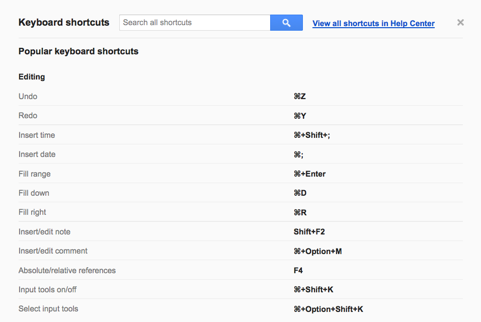
Want to undo that change you just made in your report? There’s a shortcut for that (Command + Z on a Mac / Control + Z on a PC). Want to quickly find a particular word or figure in your report? There’s a shortcut for that, too (Command + F on a Mac / Control + F on a PC). And the list goes on, and on, and on.
The most important shortcut to remember for Google Sheets, however, is Command + / on a Mac, or Control + / on a PC. That’s the shortcut for pulling up the master list of Google Sheets keyboard shortcuts. In the screenshot below, you can see some of the most popular shortcuts on the list.
2) Create a heat map with conditional formatting.
Setting up a heat map in Google Sheets is a great way to make trends and important data points easily identifiable. At its most basic, a heat map can show the highest values in your report in one color, and show the lowest values in a different color. All the values in between, meanwhile, will appear as a mix of both colors.
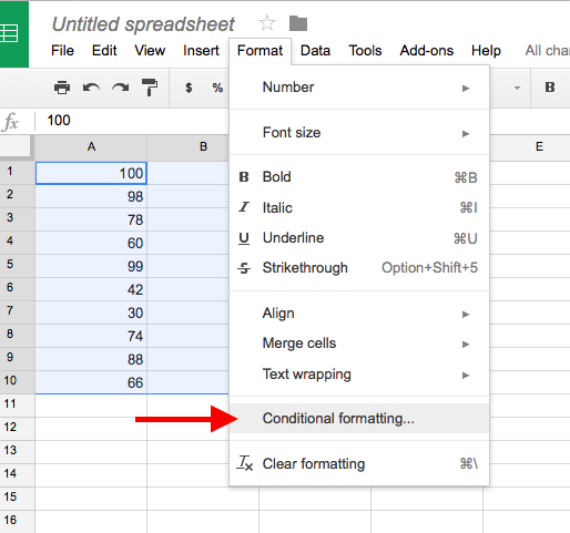
Confused? Don’t worry, it will all make sense after we walk though the steps. Step 1: Select your data, navigate to the “Format” menu in the top nav, and choose “Conditional formatting.”
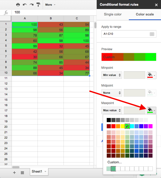
Next, you’ll want to select the “Color scale” tab from the menu that pops up. Once you do that, Google Sheets will automatically apply some default colors, and you’ll be able to see your heat map.
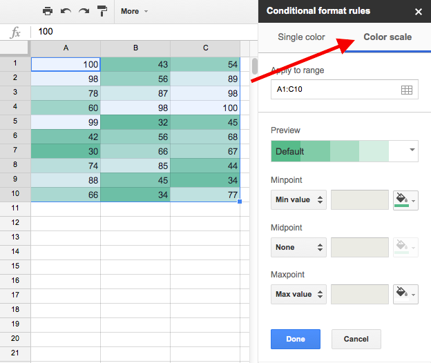
At this point, you could simply hit that blue “Done” button and call it a day. Alternatively, you could spend some time fine-tuning your settings. For example, by clicking those paint bucket icons, you can customize your heat map colors (see example below).
3) Easily add an image to a cell.
If you need to add a logo, screenshot, or other image to a report in Google Sheets, the standard protocol is to navigate to “Insert” on the top nav, choose “Image,” and then upload an image from your computer. However, there is a much quicker solution available. Here’s how you do it:
First, select the cell you want to insert the image into and type “=image.”

Next, add an open parentheses, followed by an open quotation mark, and paste in the URL of the image you want to insert. You’ll then need to close the quotation marks and close the parentheses.

Hit enter, and voilà: your image will appear.

4) Add international currencies.
If your company does business internationally, being able to work with international currencies in your reports is essential. Fortunately, Google Sheets has got you covered.
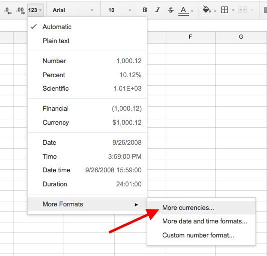
To access Google Sheets’ massive A-to-Z list of currencies — from the Afghan Afghani to the Zimbabwean Dollar — you first need to click that “123” icon in the top nav.
![]()
From there, head down to “More formats” and select “More currencies.”
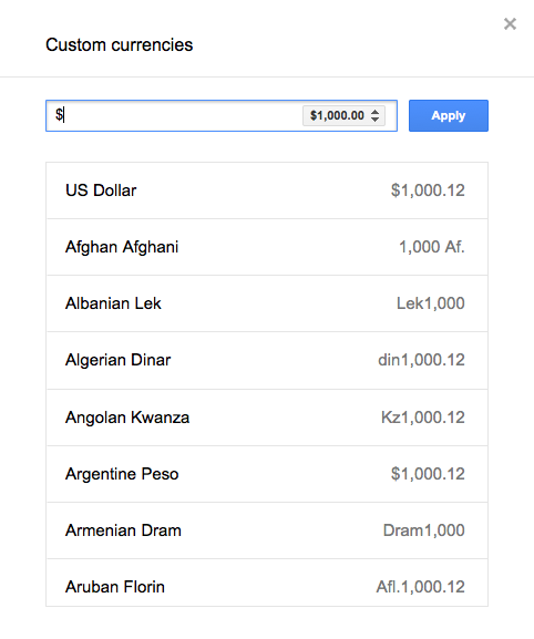
You can now choose a currency from the list and click the blue “Apply” button to set it.
5) Set up email notifications.
Want to know when a coworker makes changes to your report? Or are you looking for a way to get daily progress updates from a report a coworker is working on? If you answered ‘yes’ to either of those questions, then this is the hack for you.
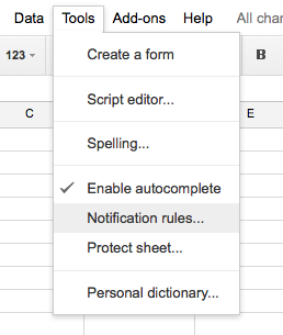
To set up email notifications in Google Sheets, first head to “Tools” in the top nav and select “Notification rules.”
Next, select what notification rules you want to put in place and click the blue “Save” button.
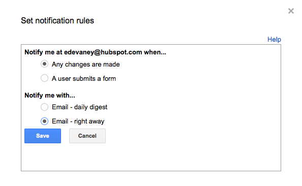
(Note: Notifications can be triggered based on changes made to your spreadsheet as well as form submissions. To add a form to your spreadsheet, simply navigate up to “Tools,” then select “Create a form.”)
6) Validate Emails & URLs
Sorting through and making sense of hundreds (if not thousands) of email addresses and website URLs is no easy feat. And in some cases, this task can get even more complicated when, late in the game, you discover that some of those emails and URLs are invalid.
Once again, Google Sheets has got your back. Using the ISURL and ISEMAIL functions, you can quickly check whether email addresses and URLs are valid or not. For example, if you wanted to check if “hubspot.com” was a valid URL, you could select an empty cell, type in “=ISURL” and then put “hubspot.com” between parentheses like you see in the screenshot below. Even before you hit enter, Google Sheets will return a “TRUE” (valid) or “FALSE” (invalid) message.

You can follow the same instructions for the ISEMAIL function, just use an email address instead of a URL. Here’s a screenshot of what that looks like:

For a full list of Google Sheets functions, check out this Google support webpage.
7) Unlock a ton of additional features with add-ons.
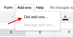
Did you know that you can sync Google Sheets with your Google Analytics account? Or that you can use Google Sheets to plot data onto a Google Map? These features — and many, many more — don’t come standard with Google Sheets. However, you can easily add them by heading up to “Add-ons” in the top nav and selecting “Get add-ons.”
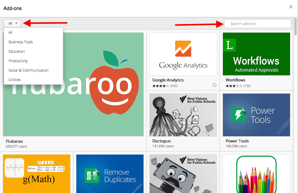
From there, you’ll be able to choose from tons of free features. You can use the dropdown at the top left to narrow down the category of add-on your looking for, or you can search for it directly using the search field at the top left. For example, if you wanted to find that maps add-on I mentioned (which is called “Mapping Sheets,” FYI) you could do a search for “maps.”
Know any other tips or tricks for making reporting easier in Google Sheets? Share them below.
